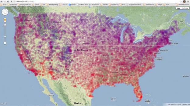
I’m taking a road trip through the southwest this winter, and was interested in seeing a map of average temperatures so we would know what we’d be driving through.
When I couldn’t find any easily, I decided to see if I could plot data from the National Climate Data Center [FTP] via the Google Maps API. I loaded the NCDC flat files from that FTP link into a MySQL database, and then exported it into Google Map objects (php writing out javascript objects).
The result is at http://xenotropic.net/climate, although it is slow (about 30 seconds) to load. Apparently that’s “normal” for a Google Map with a few thousand objects on it. I may work on clustering areas where there are a lot of data points. Here’s a screenshot so you don’t have to wait:

EDIT: I have since updated the map to cluster and average the weather stations in an area, making it a less interesting looking but more visually accurate map.
Leave a Reply